Unity Group 2.0 / The Branding Strikes Back
Energetic new times call for an energetic new look. Over the last few years, we’ve expanded in both the services offered and the markets we are active in. In 2020 alone, we:
- Moved to a fancy new office in Krakow
- Also moved to a similarly fancy new office in Wroclaw
- Launched new consolidated offer and expanded our range of technologies
- Further grew our end-to-end support with consulting initiative
- Made more than a little noise both on domestic and international markets
- Helped businesses large and small survive amidst a global crisis (caused by a tiny, annoying virus).
We’ve come a long way <since.1997>. As a result, the old branding outlived its purpose. As our company accelerated forward, it became inconsistent and slightly old-fashioned. As we make an impact on new markets, we need a brand that represents our creativity, dynamic and modern approach.
To show off our new approach we put together a pretty awesome video
The New Look
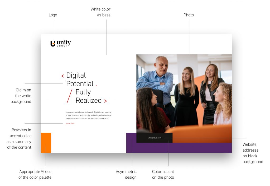
- Less is more: Minimalism and clarity of message are in. Complicated designs and terminology-heavy gibberish are out!
- Brackets, icons and other shorthand motifs: telling a story as effectively as possible!
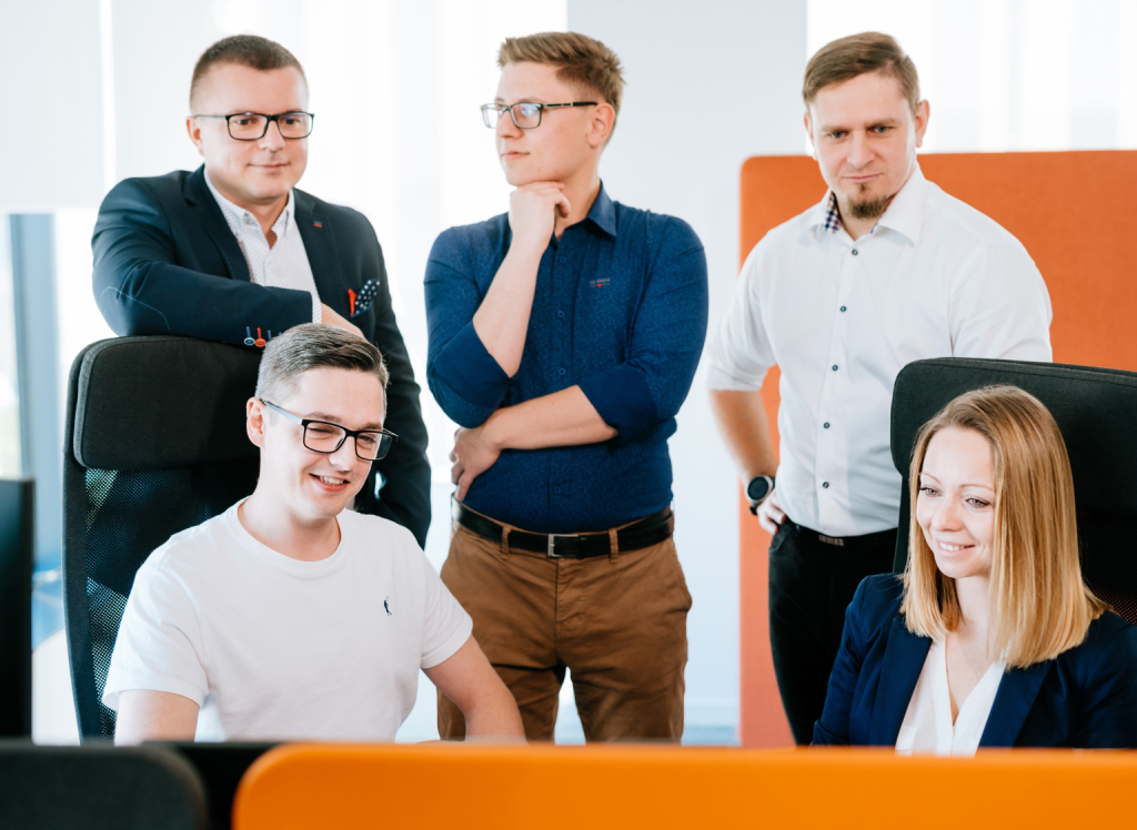
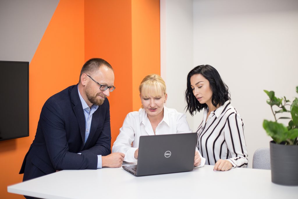
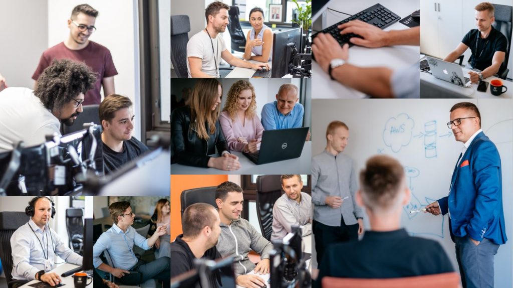
- Real photos of real people: look at who you could work with!
You can find the find the full details in our brand book, but let’s touch on the most important aspects here.
The Claim
If you only have seconds to make an introduction, make it count. As we continuously expand, we needed a new way of defining who we are. Commerce Transformation is our forte, but we wanted say it with a little more flair. Marketing may have got a little too excited at this point…
So what does Commerce Transformation do exactly? And why would potential new clients want it? These were the questions that needed to be answered.
And if we just happen to define it in an elegant and catchy way, that’s a double win…
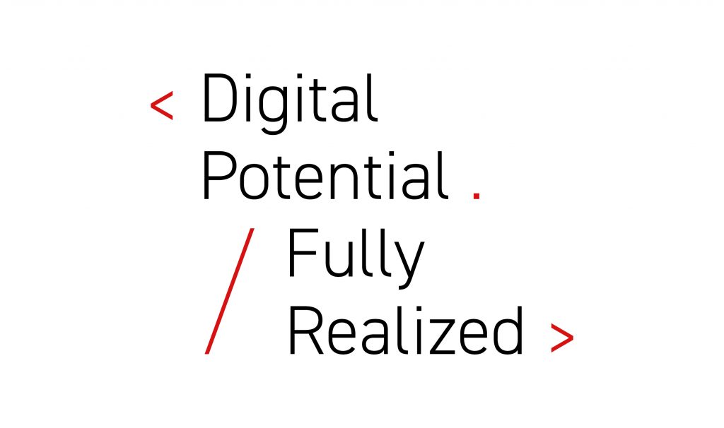
Commerce Transformation enables companies to execute on their digital potential to power and grow business. And with us, it’s done fully, so every project, goal or objective is completely realized.
< Digital Potential ./ Fully Realized > is the story of commerce transformation. It’s the story of our clients. It’s the story of Unity Group.
The People
If you’ve looked on the site, you’ve likely seen all the photos here and there. The reason for such choice is simple: it’s people* that drive our success. Our teams work side by side with our clients to create true partnerships based on mutual respect and trust. Our new image brings this to the fore.
*And a duck – she has her own story and you can read more about her here.
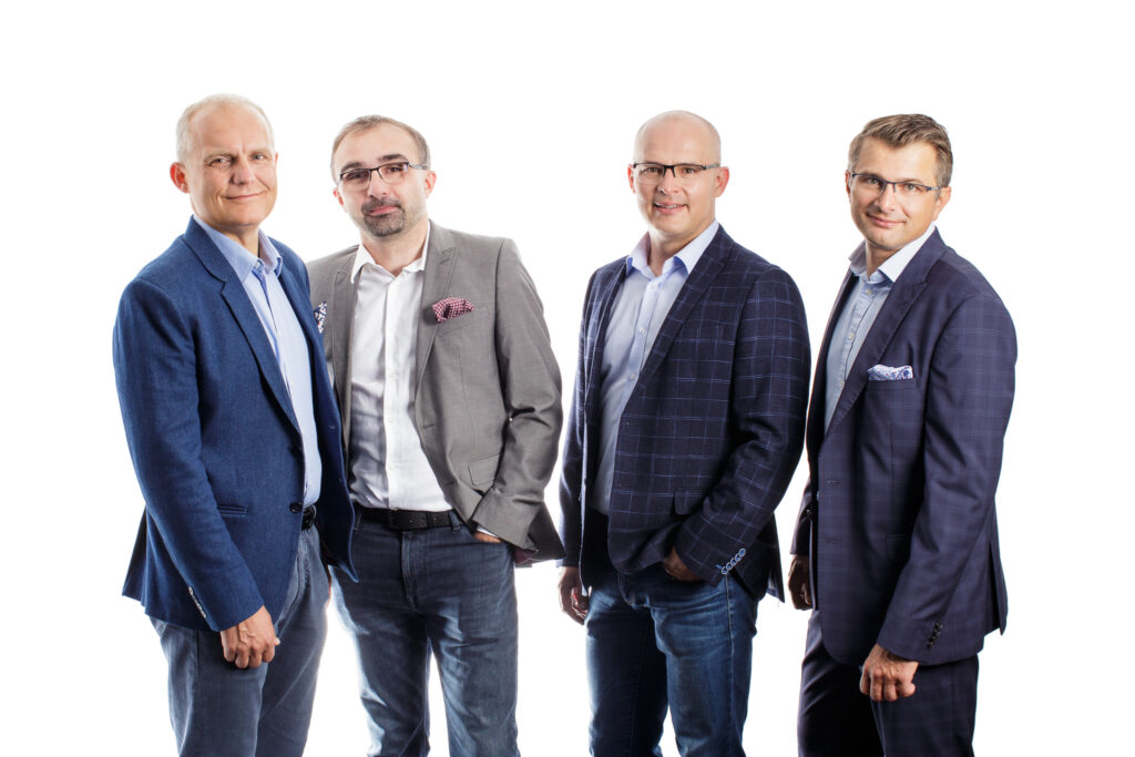
You can see people everywhere, from our Managing Partners…
…To the everyday heroes that we all know actually do the work 😉.
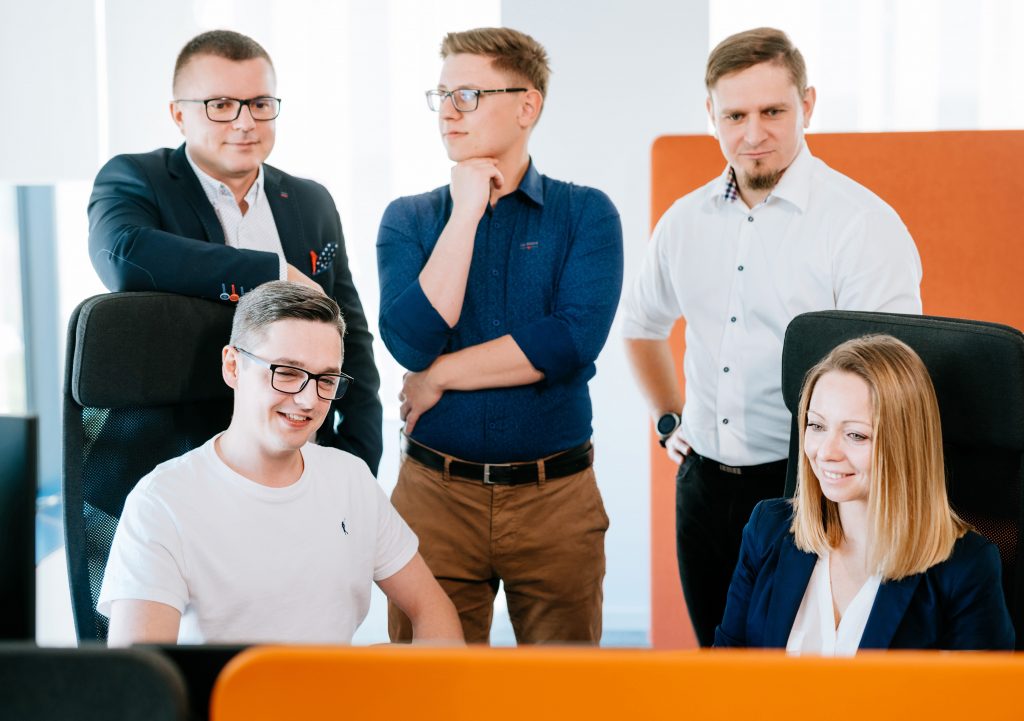
Unity Group is a larger collection of people, where everyone is equal. Heck, that’s a pretty accurate definition of both “unity” and “group”, so we owe it to ourselves to live up to the name and people-first culture that we live by. Our company isn’t a 4-person band, it’s a 260+ person orchestra!
The Color & Vibe
We wanted our new look to be exciting. So let’s start with aesthetics: every color has a purpose and, together, they help to give the right look and feel of who we are and how we want to be perceived:
White: more than just the color for when you forgot to code something, it’s clean, honest and open.
Black: a hallmark from the original branding, black is used sparingly. It hints at our expertise as well as our legacy. But much like our vast experience – after 20+ years on the market – we don’t need to shout about it, so its very much dialed down.
Violet: the biggest addition, violet represents the calm, maturity and elegance
Orange: another part of the original brand (and logo!) that balances the rest being one that motivates and inspires. With this colour we also show our cool side, which we definitely have!
Red: because a little splash of energy never hurt anyone.
Furthermore, using flat color blocks plays into the minimalist approach. We’re adding splashes of color without interrupting the larger theme.
The Shape / Order in Asymmetry
You’ll also notice through the use of color blocks, among other examples, that we use asymmetry to break things up:
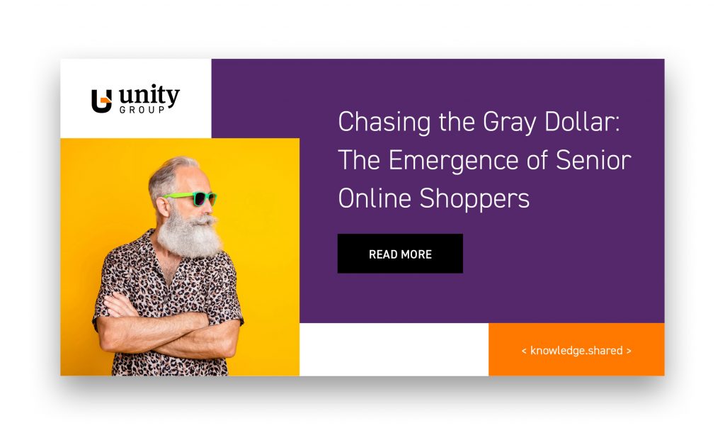
Is it a game-changer? No, not really, but it does stand out. It’s non-traditional, yet still retains order where it’s needed most. Much like our solutions, we provide a fresh perspective that still fits within the realm of modern business.
Telling Good Stories
If you can tell a same great story in less words, you owe it to your readers’ time, right?
Likewise, a strong visual impact really does matter. You don’t need 20+ years mastering e-commerce projects to learn that, but it helps. Similarly, a good story is measured by excitement, not chapters. And we all know the best stories have pictures!
We can see this best of all in our updated case studies (if you can’t tell, we’re a little proud of them 😉). Why write three paragraphs when we can highlight the key benefits in under 20 words?

Or like this. Same rules, maximum flair…
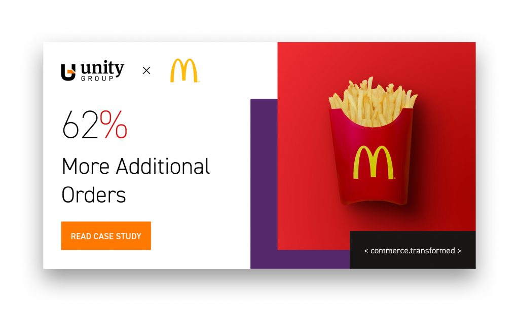
Just like that, we’ve demonstrated the key elements in a snapshot. And if you wanted to read that particular case study in full, you can! (Please do 😛 )
Brand Another Thing…
You’ve probably noticed <these.brackets> right? They’re designed to get straight to the point. If we can summarize a key benefit or value, why shouldn’t we? More than just flavor, it gives the essential keynotes. It’s <minimalism.perfected>… do you see what we did there?
What’s Next?
In the coming months, you can expect even more from us. We want to better represent ourselves and showcase our solutions in a way that not only gets new clients and employees excited, but brings a smile to our existing partners as well.
The new branding, refreshed new website and all other communication elements are just the foundation. Building the castle comes next 😉. And everyone is invited.
In the meantime, we’re always open (some would say eager) to hear what you think! Welcome aboard and we hope you will have just as much fun as we did!!
