Filters vs Slicers – Which Is a Better Choice When Designing Reports in Power BI?
Power BI is developing dynamically and is improving shared tools for data visualization. Older features are being “refreshed”, presenting themselves in a new, sometimes quite different form.
In the article below, we’ll look at the filtering mechanism that some time ago replaced the old filter cards available from different levels (visual, page, and report). We compare its features with those offered by slicers, an established tool familiar to any user of Power BI, and decide which functionality is better and why.
Basic date formatting
The difference between filters and slicers is already visible at the level of basic formatting. With slicers, we can use classic controls like the checkbox, or advanced date slicers like the relative slicer, shown in the image below. It allows you to limit yourself to e.g. today or yesterday, current or previous year, etc., without the need to indicate a specific from / to range of days.

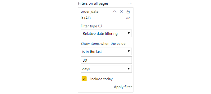
The filter panel has a similar option and contains filters of relative dates. Moreover, it seems that the advanced setting filters provide much more flexibility than what the native slicer gives us. Also, considering that slicers take up valuable space on report pages, they don’t seem to offer enough benefits to be chosen before filters, right?

Let’s recall the question that was posed at the beginning of this article:
Does it make sense to use slicers with all filter enhancements in Power BI, considering they also take up valuable space on the report page?
The answer is yes.
Although we can meet most of our basic needs related to data filtering in visualizations using the filtering window, there are several reasons why we might still prefer to use slicers when creating reports.
Slicer synchronization
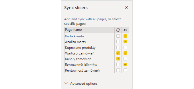
At present, filters can affect one visualization, all visualizations on a page, or the entire report (visual level, page level, and report level filters). Slicers, in turn, by using the selective sync option (tab “View” -> option “ Slicers synchronization”) allow you to choose which party reports to filter and which page is visible to the user. This provides a high level of flexibility and makes it easy to solve specific modeling problems.

Thanks to this option we can, for example, build a consistent history on a report consisting of several tabs that we will lead the user through. For example, on the first tab, the user selects the customer segment he is interested in, then proceed to the next one, where he analyzes the products they buy, selects the product categories of interest to them bought by previously defined customers. After selecting the categories of interest, the user can go to the third screen, where he analyzes, for example, granted discounts and profit margins generated in previously selected segments on defined products.
Visual interactions
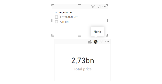
Power BI gives users the ability to tune the impact of the slicer on other visualizations visible in the report. This can be controlled by using the “Edit interaction” in “Format”.

Using this feature, we can set up the slicer to not affect our selection of some elements, but continue to filter out all the others. This visual interaction is only configurable with the help of slicers - no similar effect can be achieved with filters.

This approach makes it easy, for example, to build a mechanism comparing sales from period 1 and period 2. This is justified when the periods are customized – for example, on one screen we want to display sales from the last weekend before Christmas and compare them with sales on Black Friday.
Layout and positioning
Slicers are visual elements, so they enjoy the same freedom of movement as other visualizations on the report, while filters do not. This is at the same time a great advantage and disadvantage. When designing reports, it is sometimes important to position the slicer close to another visualization, like a chart, if they are closely related and this layout is more intuitive for the user. The filter window, in turn, is pinned to the right side of the report workspace, and at the moment it is not possible to relocate it. In addition, filters come only in basic and advanced layouts, while slicers have unique visualization templates. For example, they can appear in the form of checkboxes, a horizontal orientation bar, a list, a drop-down menu, sliders, etc. We can also give slicers a name that more closely matches the context they are to be used in. For example, if we have a product table in the data model, then depending on the report, we can filter by products bought, sold, products in stock, or manufactured products. In the case of a filter window, we will always refer to the name from the data model.
Summary
When building reports, remember to consider data filtering needs as they apply to planned visualizations. Keep in mind the examples given above and the differences outlined when deciding whether we need a filtering window or prefer to stay with a classic slicer. If we want to enable more extensive date filtering, we should use the filtering window, because it contains more powerful filtering options. In turn, if we want to have a greater impact on the selective filtering of data in visualizations, we should reach for a slicer. You can always choose hybrid solutions in which simple filters are implemented as slicers, and users with more advanced needs will be able to use the filter window.


