Design System vs Pattern Library vs Style Guide / A Single Source of Truth
Recently, we’ve covered the likes of headless architecture, omnichannel and multiexperience processes and, well, probably half a dozen discussions on the state of e-commerce. More often than not, we’re focusing on making the backend as optimized and efficient as possible.
But users don’t see the backend (unless something has really gone wrong) – they see the frontend. What can we do to optimize brand visuals? To ensure a consistent user experience and, perhaps just as importantly, not drive ourselves crazy trying to manually do it?
You read the title, so let’s answer the most important questions: should you create a design system? And to answer that, we should start with the core elements – atomic design, design systems and the traditional alternatives.
Atomic Design / What’s the Goal?
First created by Brad Frost (who might have other talents too, but will surely go down in the history books as “that Atomic Design guy”), Atomic Design focuses on breaking designs down to their most visual basic elements: the atoms. And atoms, as we all know, make up everything*.

- Atoms are the most basic elements: colors, buttons, fonts and even abstract design rules.
- Molecules are combined from atoms. A search box, for example, uses a specific font and label, input box and actionable button, all of which are defined at the atomic level.
- Organisms are the next level up, grouping multiple molecules. This is where menus, and other navigable sections are created.
- Templates are what most people are already familiar with: blank frameworks designed for content input before going live. The difference here is that these templates are built on organisms.
- Pages, then, are the final product. They are based on templates, which in turn are based on organisms, molecules and atoms.
*Of course, not every part of a page is unique. Images, for example, are often only used once. However, by using organisms and templates, we define the rules in which such images appear, ensuring maximum consistency.
What is a Design System?
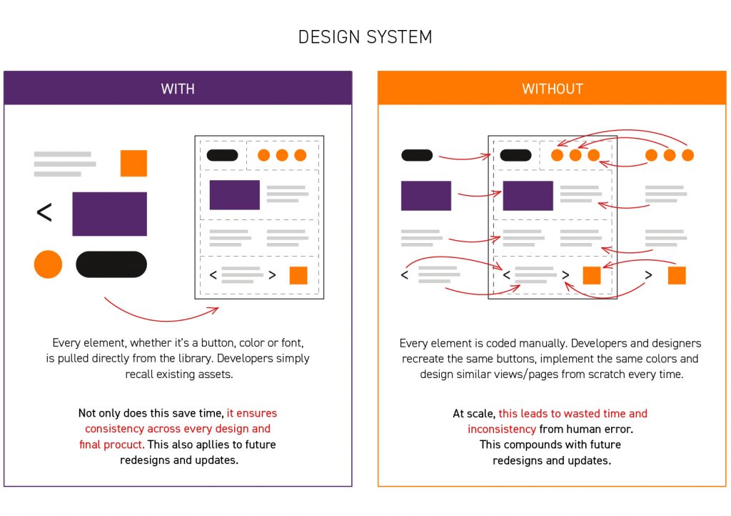
A Design System is essentially an automated atomic design library. It consists of a digital pattern library with predefined and, more importantly reusable, assets: the atoms, molecules and organisms of atomic design. Instead of manually entering the same elements, designers simply ‘pull’ from the library whenever that exact element is needed.

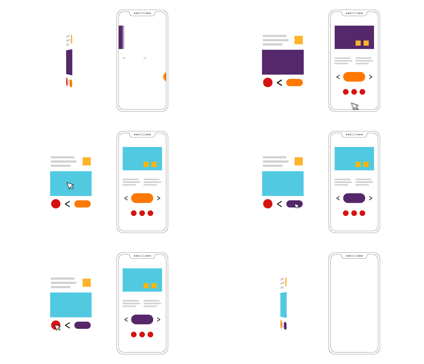
For example, if you change an atom – let’s say a certain brand colour – this should then ripple out across the entire branding. Every page draws from the same organisms, which in turn pull from the same molecules and – you guessed it – the atoms right at the bottom.

Design System / Benefits
Quicker Design Time – Since a design system has a built-in style guide and UI kit by its very nature, designers already have the initial framework to move forward. In most cases, they’re utilizing the existing atoms and molecules, skipping much of the early design steps in getting straight to the good stuff.
Quicker Development Time – When you think how many buttons are on a page or app view, or how many times designers need to implement the same colours, fonts and input elements, it’s easy to see how much time a design system saves. With reusable elements, we simply code one, and use multiple times. It’s essentially the copy and paste of the frontend world.
Ensured Consistency – With a design system, there’s no confusion. Developers won’t make mistakes implementing certain features, because it’s not possible. They pull directly from the library, so every developer should be able to implement the same thing. As a side benefit, this also means further enables teamwork, too! (we like teamwork 😉 )
Greater UX – This one’s a no-brainer. Consistency in user-facing elements ensures a greater experience across any and all corners of the brand.
Scalable – Expanding your business? More websites, apps, portals and other systems result in more concepting. Design Systems scale this to be as efficient as possible: you can do more with less.
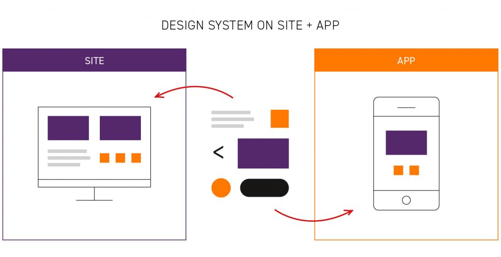
Decoupled Visuals – need to replatform? Great! A Design System can easily transfer your branding from one platform to the next and, hey, that’s one less massive task to deal with, right?
Design System / Drawbacks
Initial Investment – Ultimately, a design system is an additional feature that itself needs to be designed and implemented.
Retro-fitting – What happens when you already have a website or app and wish to retroactively apply a design system? We’re certainly not against it, but we’re not going to lie: this takes more time and subsequently costs.

What is a Pattern Library?
Pattern libraries are similar to design systems in many ways. They are repositories of UX and UI elements that frequently appear on a website. Navigation elements, carousels, social media features and more can all be considered part of a pattern library. Once one design creates them, they’re added to the library for everyone to use.
The difference between this and a design system is that the latter is much more atomic. As such, changes ripple out automatically and, as a result, a design system typically influences much, much more.
What is a Style Guide?
If a pattern library showcases visual elements, a style guide is the broader documentation. It describes how to use the elements, as well as rules for how the brand should feel, what language to use and how it should work overall. They’re more “instructions” and less “reusable components”.
Pattern Libraries and Style Guides / Benefits
Documentation – Even if you don’t have a design system, a single source of truth is always a good idea. Pattern libraries and style guides offer a central repository for that.
Consistency – Well, some consistency. When design rules and visual features are displayed in one location, there shouldn’t be any reason to deviate.
Encouraged Thinking – At the very least, simply having such documentation gets your teams thinking about branding, consistency and UX. Without this reinforcement, it’s the wild west across larger teams.
Pattern Libraries and Style Guides / Drawbacks
Not Automated – Pattern libraries offer consistency but typically require the developer to copy and paste into the frontend. For example, Mailchimp’s pattern library has everything designers need, including code snippets, but it’s not necessarily automated.
Open to Interpretation – when the design rules aren’t enforced, developers can interpret things differently. A style guide can’t enforce anything without an editor or brand manager, while a pattern library still enables developers to choose or otherwise ignore existing components.
Scale Creep – Without enforced usage at the atomic level, it’s easy to expand a library beyond interpretability. Looking at Mailchimp’s library, there are a plethora of colors not used on the most prominent pages – but the explicit use of these is arguably not as clear as it should be.
Smaller ROI – Pattern libraries and style guides still require manual work. Consequently, they don’t save as much time (and can still lead to the occasional inconsistency on the UX side) so the overall ROI overtime is much, much slower.
The Headless Approach
You might have noticed that a design system has a lot in common with a headless CMS or even Product Information Management systems (if you’ve come here by way of e-commerce). There’s a good reason for that – they all play very well in headless space.
Headless architecture is about separating the frontend and backend. With a headless CMS, we’re already doing that with the text, so a Design System is a natural counterpart. This also applies to Digital Experience Platforms too – they just don’t have “headless” in the title.
Multiexperience / The Best Place for Design Systems
If we’re going to go down the headless path – especially with Digital Experience Platforms – let’s go all the way. Multiexperience is the art of providing a consistent brand experience on every channel your on, but also adapting the experience to best fit that particular device.
Unsurprisingly, design systems ensure brand consistency across all elements. Even if you do need unique molecules for certain devices, the atoms will remain consistent.

It’s also not just digital either! A Design System incorporates the best parts of the style guide and pattern library, so physical materials, such as catalogues and other assets (all of which are designed digitally) can still benefit.
When are Design Systems Not a Good Idea?
There are two main reasons to not consider a design system:
- When your overall digital presence is a singular website of such a small scale to not warrant the investment.
- If your design is rather fluid and you’re not using atomic design.
Let’s put our own cards on the table: we (Unity Group) don’t use a design system. We do have our brand guidelines and specific rules, but as our website is relatively small and we’ve no plans to produce a kickass app any time soon, it didn’t mesh well with our asymmetric visual approach.
Taking Your First Steps
“In a lot of ways, this is how we’ve been doing things all along, even if we haven’t been consciously thinking about it in this specific way.”
Brad Frost, that Atomic Design guy
Investing in a Design System is a “sooner rather than later” decision. After all, it makes work shorter and more consistent, so it’s always better to get that set up before you start. So, in regards to your present and immediate future:
- If you’re planning future expansion
- If you’re planning any changes in your branding, big or small
- If you’re looking to future proof your digital user experience
Then a design system is a worthwhile consideration. But if you’re a small scale business with only a few visual requirements, then a headless CMS will work wonders – better to have designers work on a few amazing designs than a custom library.


